UNITED NATIONS
Simplifying Access to Critical UN Pension Information
How we increased satisfaction and reduced frustration through the power of Information Architecture.

CLIENT
United Nations
The United Nations Pension website struggled to meet the diverse needs of its global pensioner audience, with a disorganized structure causing widespread user and administrator frustration. This confusion led to a surge in help desk inquiries, resulting in longer response times and increased user dissatisfaction.
We began with content analysis, usability, and accessibility audits to identify site issues, followed by interviews with a range of stakeholders from pension contributors to support staff.
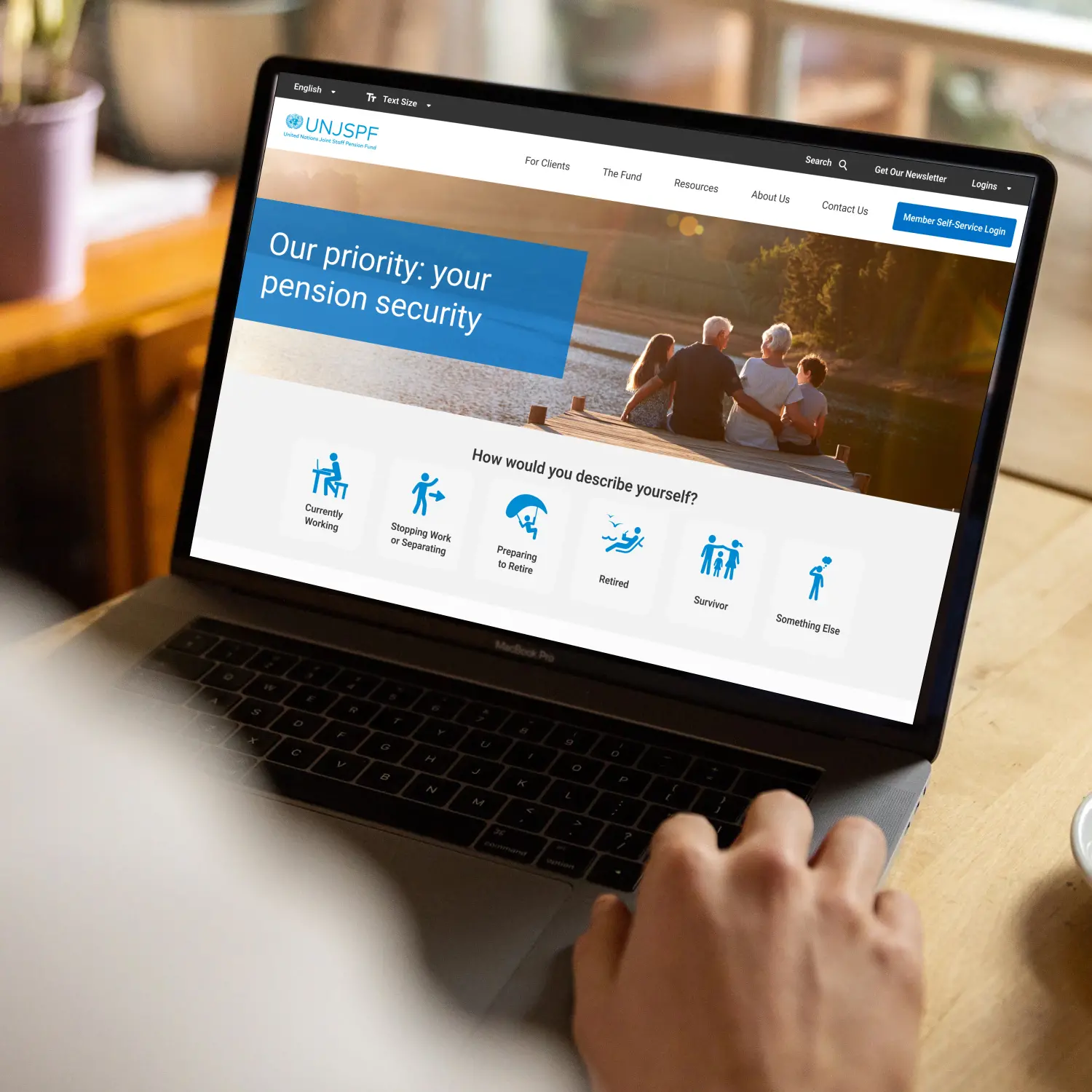
The insights led to a reorganized view of grouped and tagged content, adhering to hierarchical best practices for improved navigability and user experience.
MY ROLE
Competitive Analysis
Accessibility Analysis
Stakeholder Interviews
Journey Mapping
Information Architecture
Product Strategy
Design System
UI Design
Prototyping
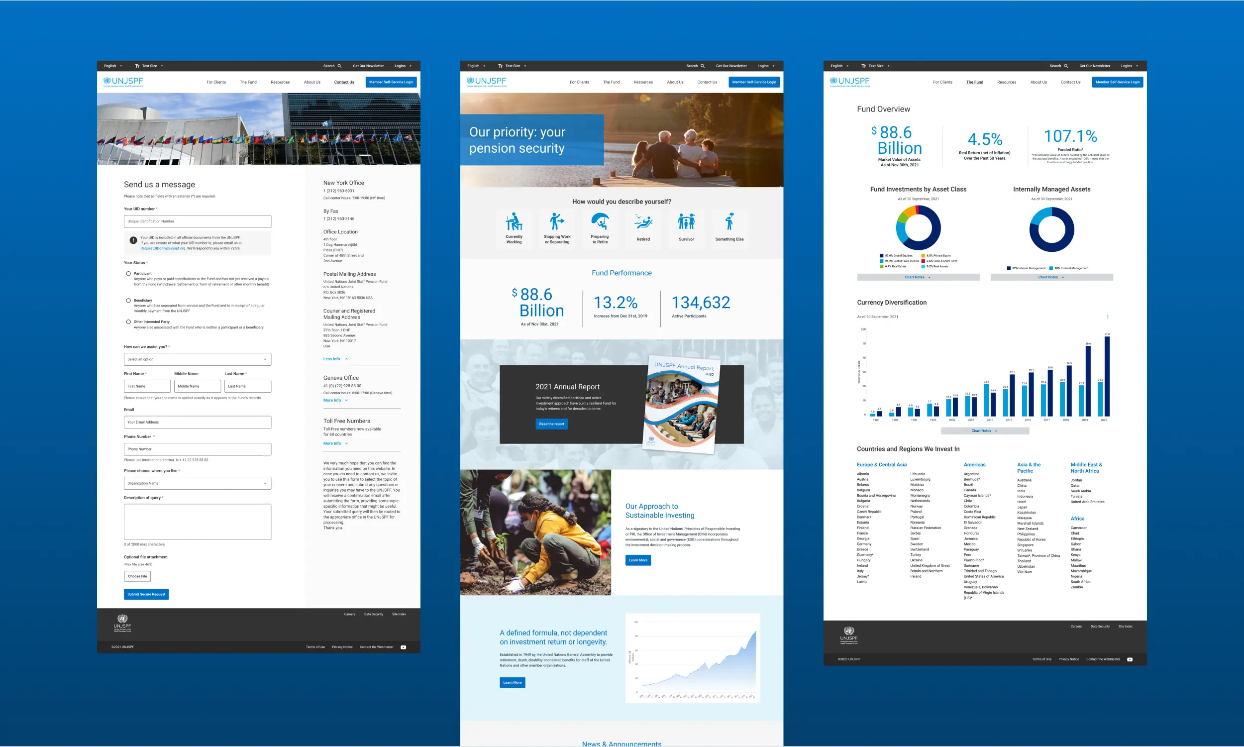
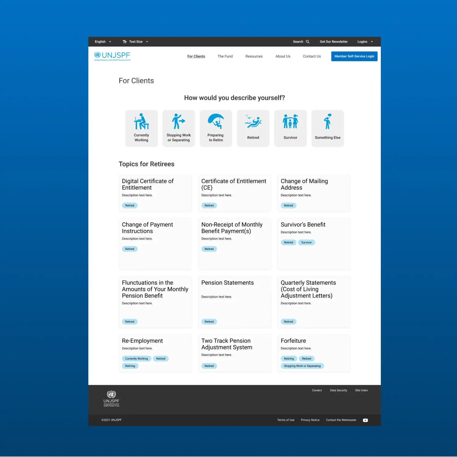
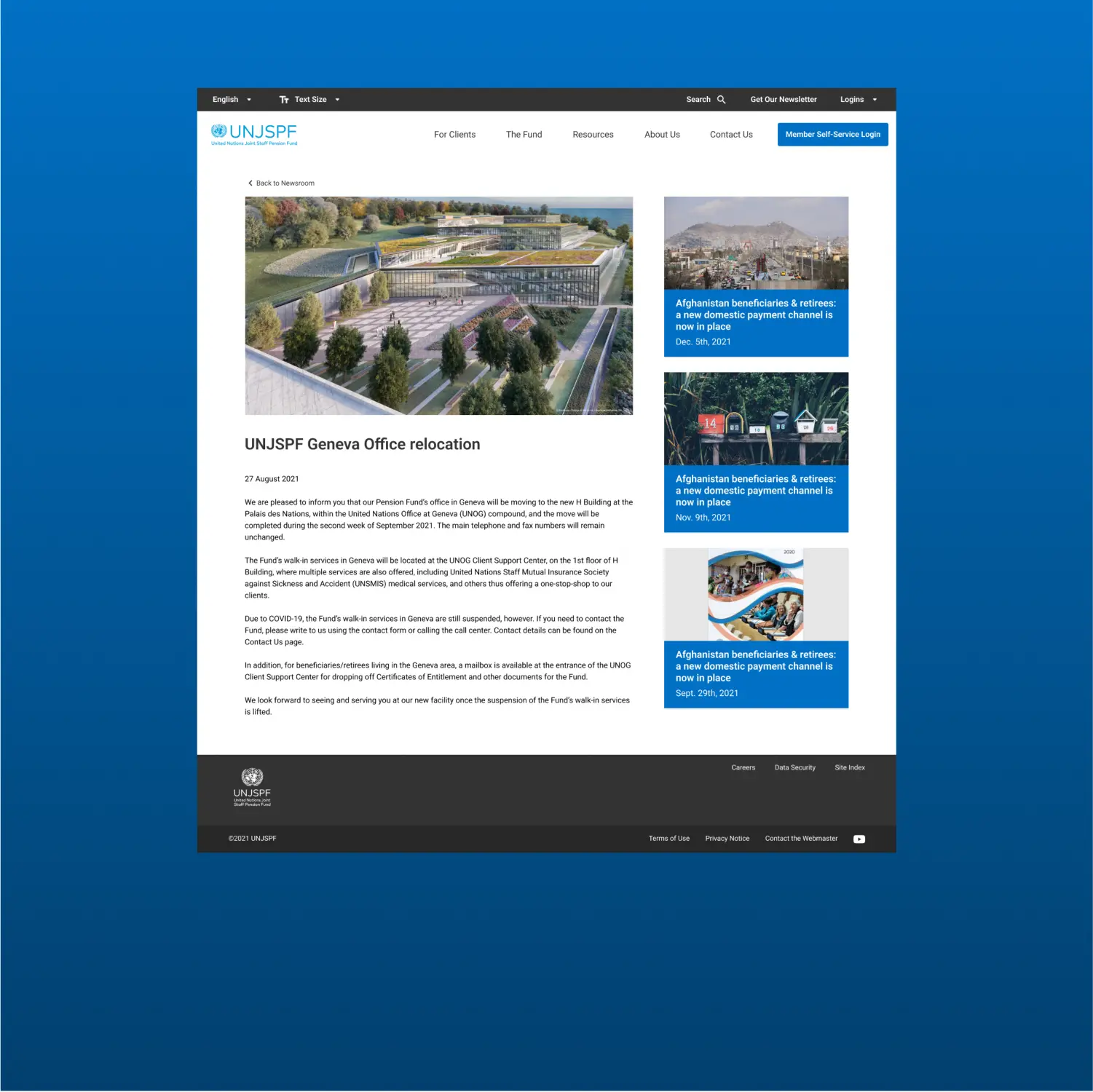
STRATEGIC AUDITS
The initial focus was on conducting a series of detailed audits that served as the cornerstone of our redesign strategy.
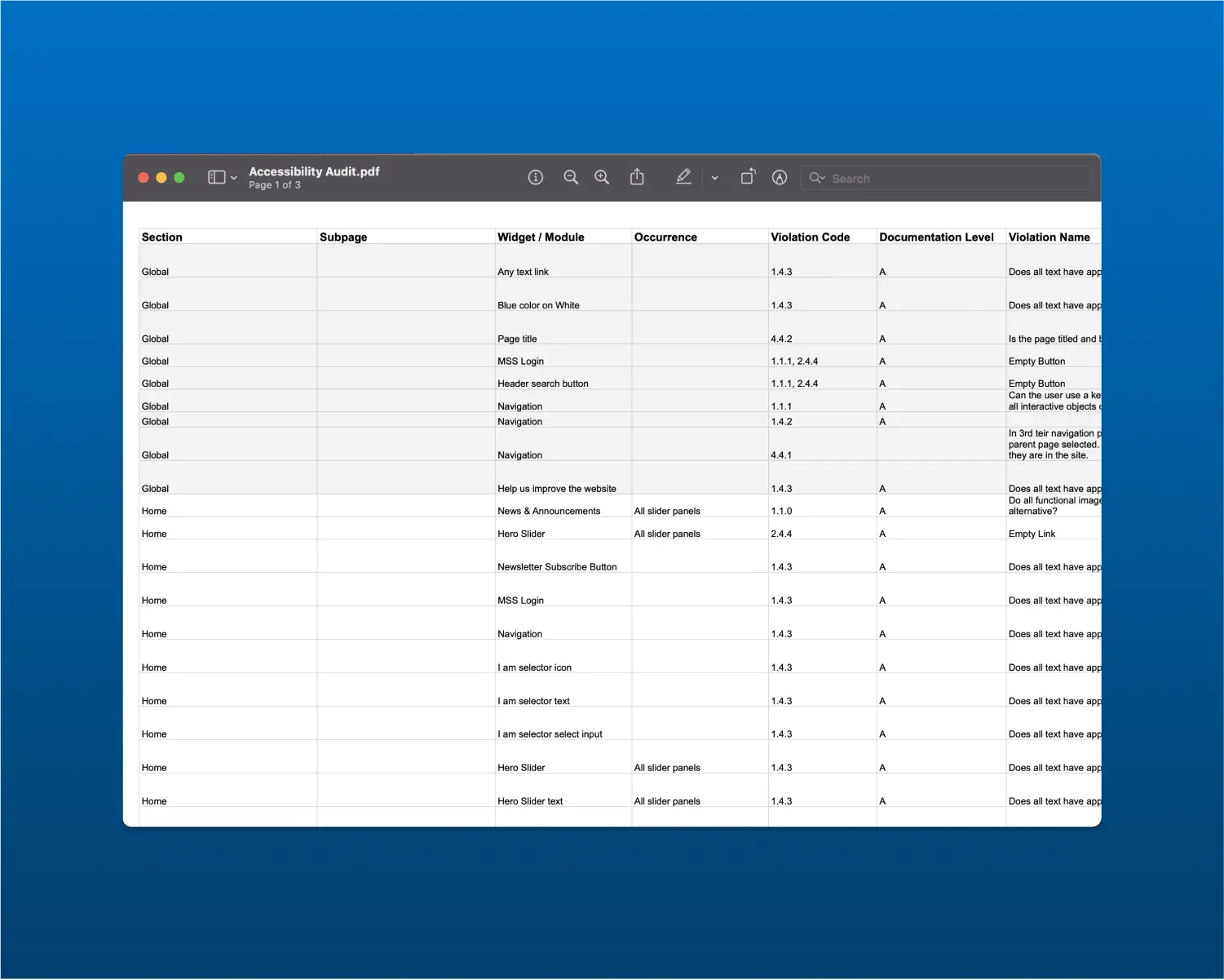
> ACCESSIBILITY AUDIT
To accommodate the UN's diverse clientele, we initiated an Accessibility Audit, identifying and addressing barriers for users with disabilities to ensure an inclusive digital environment.
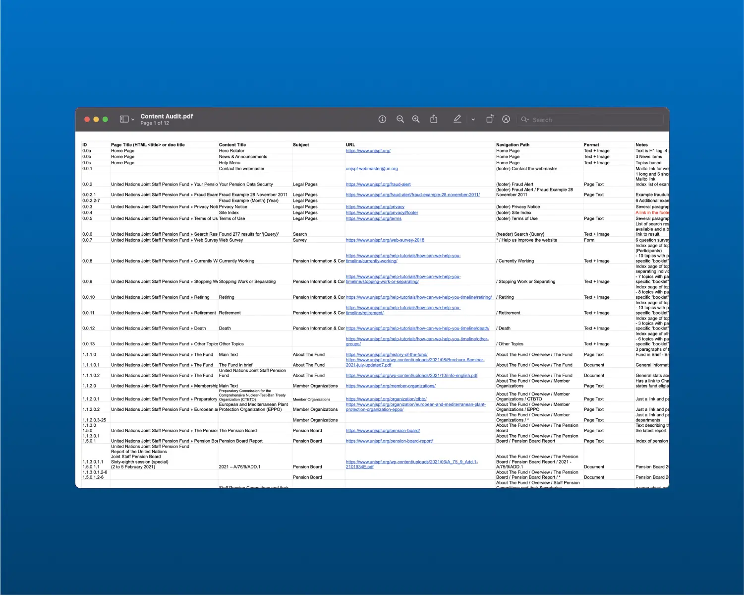
> CONTENT AUDIT
A detailed Content Audit was conducted to scrutinize the existing material, highlighting its merits and identifying improvement areas for clearer, more relevant information delivery. This audit revealed significant information architecture challenges that required attention.
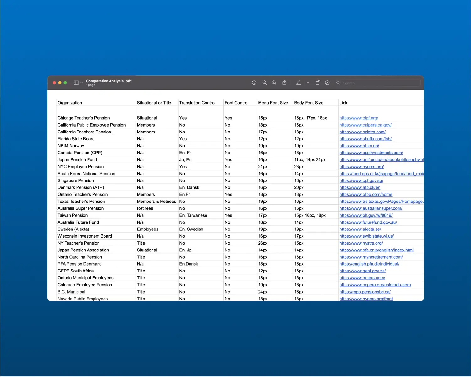
> COMPARATIVE ANALYSIS
Comparative Analysis of leading pension providers helped us benchmark the UN Pension website against its peers. This review of their digital presence and user experience strategies offered crucial insights into the UN's competitive position, guiding our focused redesign efforts.
KEY INTERVIEWS
To deeply understand the needs of users, we embarked on a series of interviews with participants form around the world, focused on uncovering the most crucial information types and how the current UN Pension website was falling short in meeting these needs.

Zoom interviews with UN employees across the world.
"A lot of the time, you find, the same question being rephrased in different ways and the same content is being repeated into the places."
"Do pensioners come to the site to see policy benchmarks? They can't, because it's confusing. If it's more for investment people..."
"Because right now, if you look it's quite overwhelming. And if you look at it on your phone, it's like, scroll, scroll, scroll, scroll."
"We directed clients to use this portal directly. Also, even though they go to the site, they still need some interpretations. So then we had to explain them."
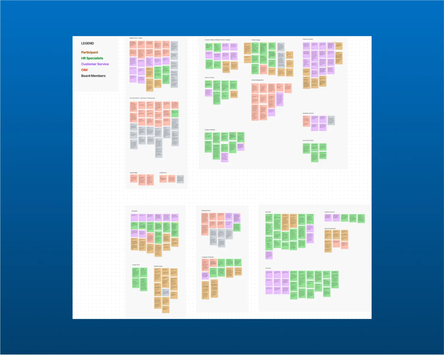
> AFFINITY MAPPING
By clustering similar points and identifying patterns, Affinity Mapping provided us with clear, actionable insights, guiding the focus on the most pressing challenges and opportunities for the UN Pension website redesign.
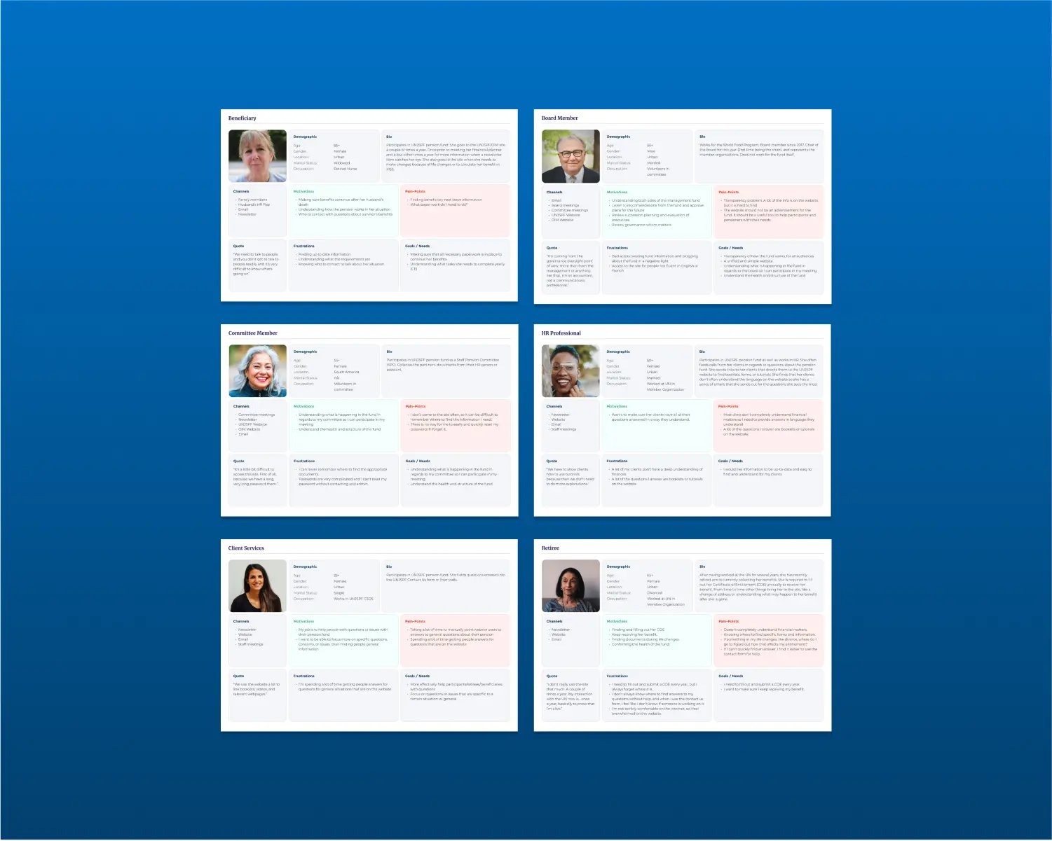
> PERSONAS
By utilizing detailed profiles, we were able to empathize with and predict the needs of our users more accurately, ensuring that the redesign catered to real-world scenarios. This user-centered approach allowed us to tailor the website’s functionality and aesthetics to meet the specific expectations and requirements of our varied user base.
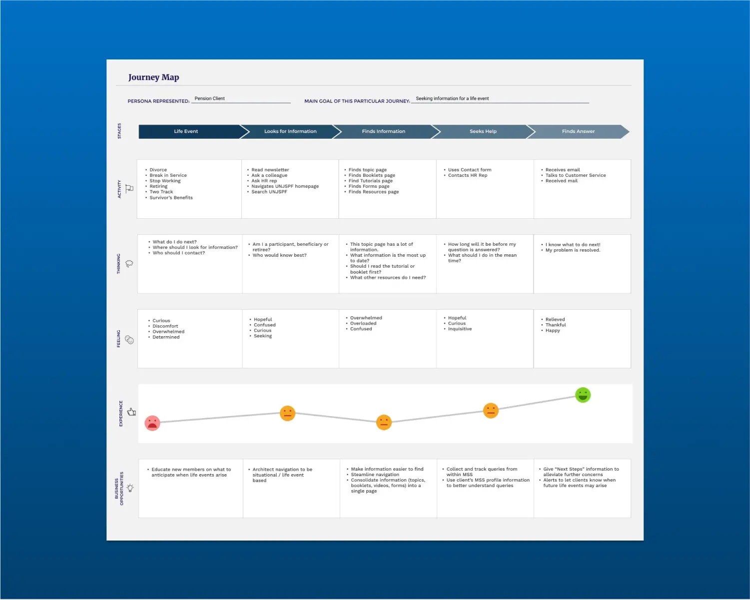
> JOURNEY MAPPING
By Journey Mapping the end-to-end experiences of the users we were able to identify critical touchpoints, pain points, and opportunities for improvement.
INFORMATION ARCHITECTURE
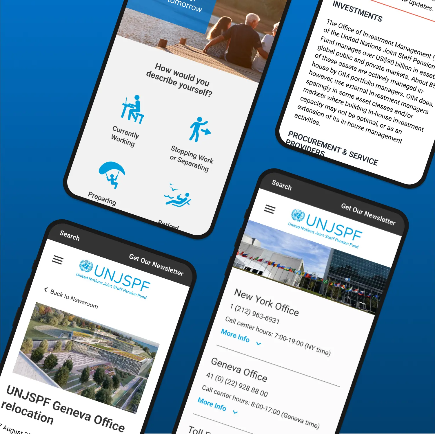
Recognizing that users previously faced challenges in locating critical information, we meticulously restructured the site's layout and navigation.
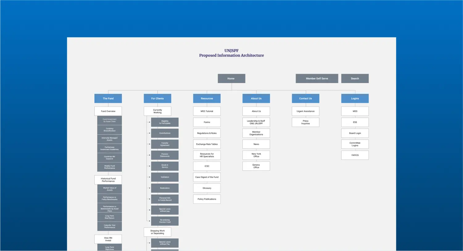
> SITE STRUCTURE
This involved categorizing content logically, improving search functionality, and creating intuitive pathways to the most sought-after information. By doing so, we transformed a once-confusing maze of data into a streamlined, user-friendly interface, ensuring that essential information is now easily accessible, and the overall journey through the site is smooth and straightforward for every user.
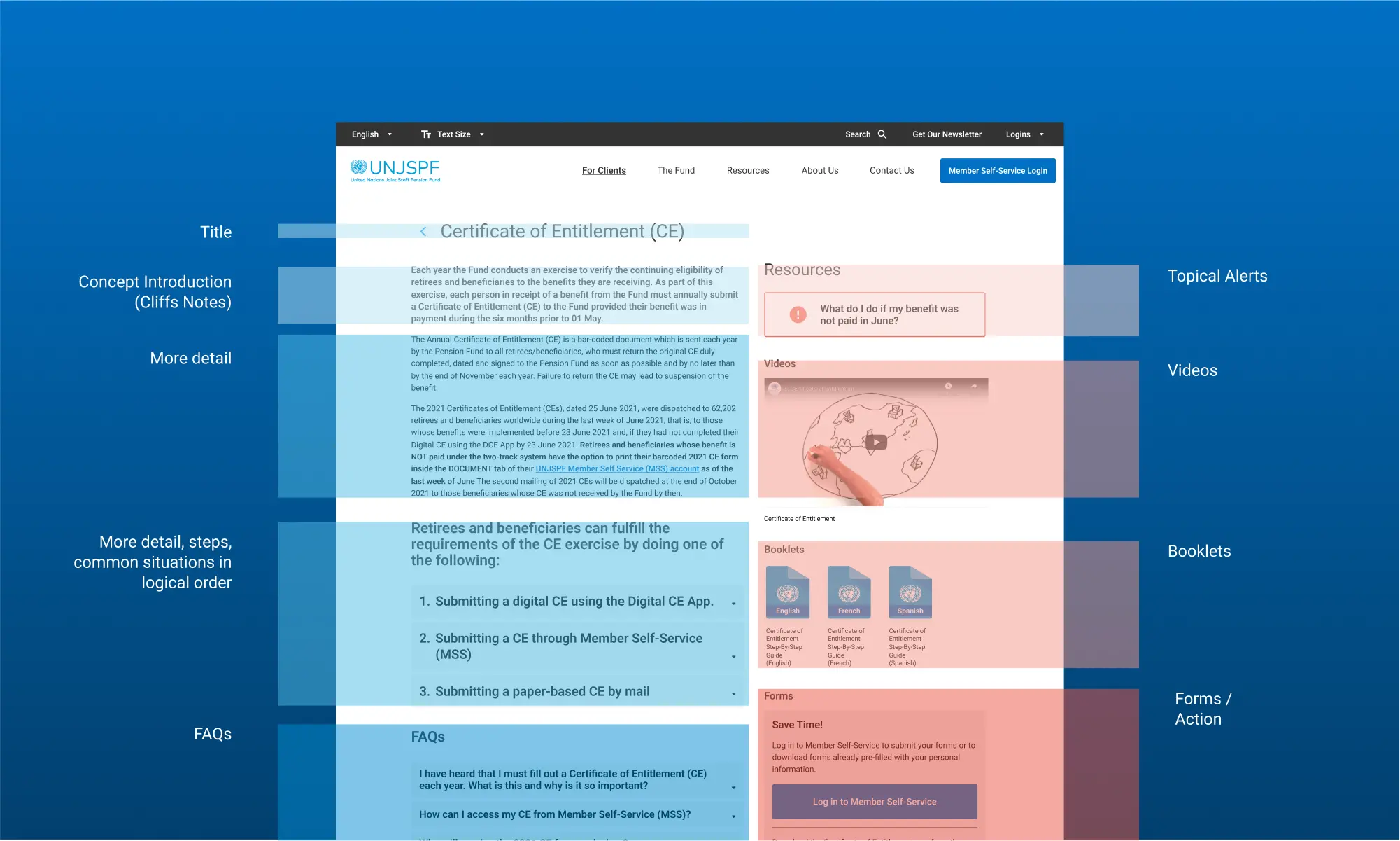
> PAGE STRUCTURE
By organizing content into distinct, hierarchically arranged sections, we eliminated confusion and made information discovery more straightforward. This strategic organization not only improved the usability of the site but also created a cohesive and harmonious user experience, making the process of finding and understanding information on the website effortless and intuitive.
VALIDATING DESIGN DECISIONS
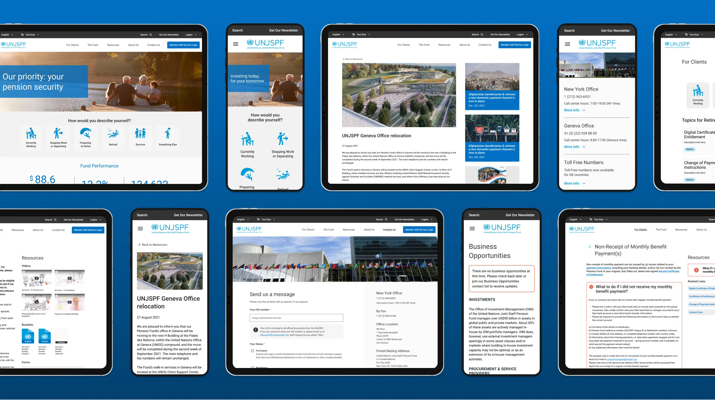
To validate our redesign, we developed a high-fidelity prototype of the new UN Pension website using Figma. We conducted usability tests with 4-5 users, carefully selected to represent the profiles of both Beneficiaries and Contributors.
• Our objective was to ascertain whether the redesign marked an improvement over the previous site.
• To minimize presentation bias, we alternated which version of the site was shown first.
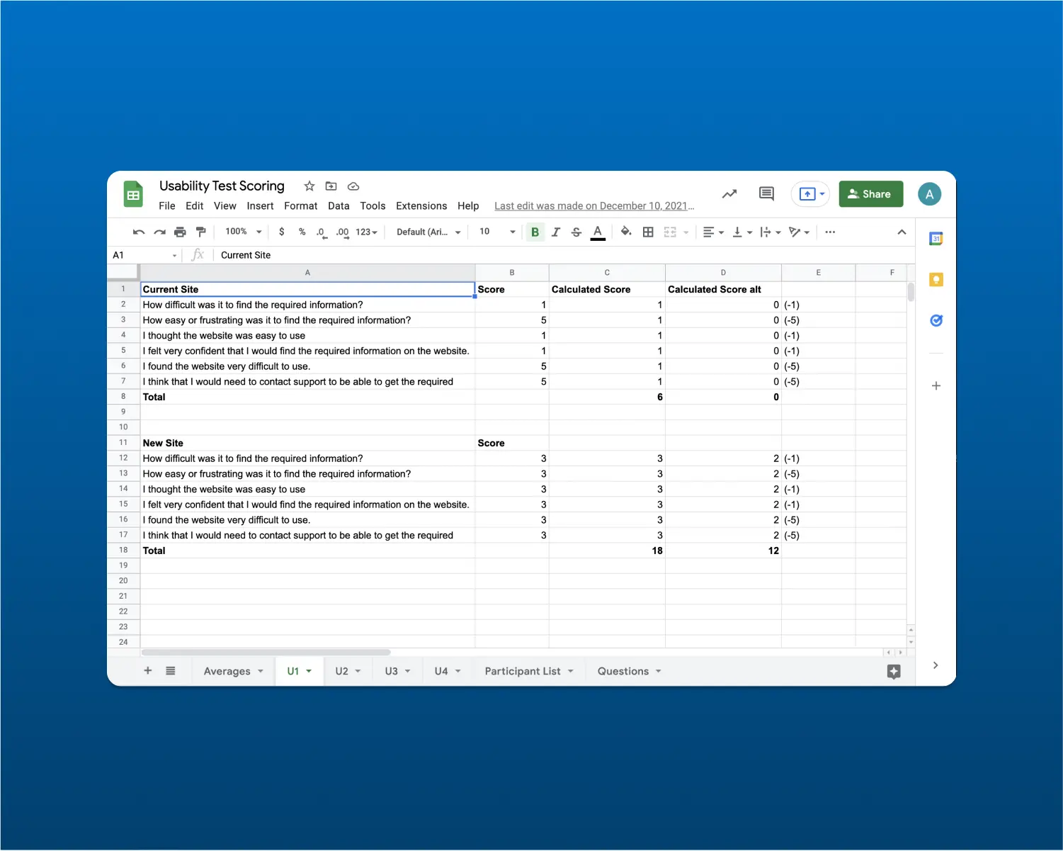
• Participants were asked to rate their experience using a modified System Usability Scale (SUS), providing quantitative feedback on the enhancements.
• Additionally, we compared the time taken to complete identical tasks on both the old and new sites, allowing us to quantify improvements in terms of efficiency and task completion time.
> RESULTS
• We improved the SUS score from 38 for the old site to 76 for the new one.
• Our time-on-task calculations indicated an expert user could get to content anywhere from about the same to in some cases saving as much as 7-9 seconds.
• We had positive comments on our new page layout and navigation structure from all participants.
DETAILS
BUSINESS
CONNECTIONS
CONTACT
© 2022 Adam Yale. Product Designer & Strategist
